Monday, January 19, 2015

Iron Shoe Kumis

Because horse shoes!

Kumis is a beverage widely possible in central Asia, primarily Mongolia. The goal of this project was to market this strange, exotic drink to an American audience. It's mildly alcoholic, slightly sour, and made from fermented horse milk. I hear it's delicious. I mean, look at these bottles. They look all kinds of delicious.

Because I have very little experince in milking horses, I used glue, water, and food dye for this photograph. Which - conveniently - means it's still technically a horse product.
Horse milk! Now available in horse milk flavor!

The remarkable taste of kumis shines brightly through in this original, unflavored variety of our classic Iron Shoe Kumis. With no flavor additives, the light body and slight sour tang are more apparent in our original variety than with any other flavor on the market today.


Sourced from Rainier cherries, the all-natural flavors that go into this sweet and tart variety of Iron Shoe Kumis compliment any palette. The cherry sours mix with the natural sours of kumis to bring you this bold and refreshing twist on a classic beverage.


Just like the fermented horse milk your grandma used to brew, this delicious variety of Iron Shoe Kumis incorporates local Kansas City grown and organically sourced blueberries to bring you back to the lazy summer afternoons of your youth.


Natural honeydew extract and top quality Iron Shoe Kumis come together in this delicious and refreshing beverage. The subtle sweetness of honeydew compliments the natural tartness of kumis to satisfy your thirst.

Sunday, January 18, 2015

Rainbow Bradbury

(I am so sorry for that title.)


I made a thing! More specifically, I made a series of things. Even more specifically, I made a series of three posters featuring inspirational quotes from science fiction writer Ray Bradbury. And look! They line up all fancy-like!

 Zigs!Zags!Zips!

The goal was to give it a 70's futurist feeling, and to that end I took heavy inspirational draws from early Atari ads. It's simple, but I'm fond of the effect.

Thursday, December 4, 2014

Soy Inks

As opposed to all those inks made from baby otter blood.

You wanted to know things about inks made from soy? Here's a poster that explains that. You can click on it to enlarge the image and read it better, if that's your thing.

I'm not sure why I made this.

Thursday, October 30, 2014

Cannibal Animals

The American Royal is a livestock show, barbecue competition, and rodeo that takes place annually in Kansas City, Missouri.

I took their branding and rubbed cannibalism all over it. Because their barbecue is too good to resist is the idea.

Chicken-fed chicken for that double-chicken taste.

He was originally eating bacon, but barbecue bacon doesn't exist. Yet. Patent pending.

No it's not mad cow disease because there's no cow brain in the steak. But I admit that's a valid and terrifying comparison.

Flying high above the city, sauce and screams dripping from his beak.

That text is from a 1911 German newspaper. Time travel is included in the advertising budget.

Fashionably Abominable

Thursday, October 23, 2014

Belly Bites

Arf!

I made a dog treat box for school and it's adorable. Look at it's lickity little tongue and woobly little legs.

The paper it's sitting on is a class critique. I've been working on this project for a week or so, and this is the second iteration of this box. As you can infer from the sheer quantity of notes on the template, there will certainly be a third.

So crack open its skull and feed your pets with the innards of this adorable little doggy box! It's technically not cannibalism!

Thursday, October 2, 2014

An Absurd Memory

Blind in Life - Blind in Death

New assignment! This is one of the first projects we as students have done for an outside client. The goal was to capture the essence of seven short plays by renowned playwright Samuel Beckett for an upcoming performance at Johnson County Community College. The plays include:

Act Without Words II: In which two people of disparate personalities are stored in sacks.

Ohio Impromptu: In which an old man reads from a cryptic tome to an old mute man.

What Where: In which there are only five left of a group of four men.

Play: In which three burial urns take turns spinning yarns.

Come and Go: In which three women sit on a bench.

Breath: In which there is breath.

Footfalls: In which a sick child either exists or does not.

Death and confusion play major roles in each performance, which is why my main graphic consists of a sightless skull. The icons overlaid on top represent imagery from the individual acts. They are loosely joined by broken, ashy lines, implying the thematic ties that necessarily join each, but only in a superficial - or broken - nature.

Bring your kids!

Thursday, August 28, 2014

Type Tattoo Week! Day 6: Look & See

Look. See. Take a look-see.

Much rougher, much less type, but I've discovered recently that I'm pretty fond of creepy tattoos.

The idea with these is that one would be applied one to each palm.

Wednesday, August 27, 2014

Type Tattoo Week! Day 5: Shall Pass

True for all tattoos, excluding those on very well-preserved mummies.

Did I mention that the project is to design a henna tattoo? Because that detail is important to note for this pun.

Tuesday, August 26, 2014

Type Tattoo Week! Day 4: Above

I like drawing scrolls.

More tattoo motifs! The typographic focus in this one is mainly the letter spacing and thin slab serif style.

The words mean nothing but are vague enough concepts to mean quite a few things. So that's nice.

Monday, August 25, 2014

Text Tattoo Week! Day 3: Ampersand

Ampersand is a truncated form of the term "and per se and," which is neat.

When designing the most generic typographic tattoo, it helps to use some of the most generic tattoo motifs. Hence this half-filled ampersand.

Sunday, August 24, 2014

Type Tattoo Week! Day 2: Still

Still breathing. Still here. Still alive. Still fighting. And yet - still standing still.

I chose this word for the second tattoo mainly because of the anatomy of the type. The lower finials of each of these letters forms a neat little hook motif that I think works well with the idea of stillness - keeping things in place and all.

Saturday, August 23, 2014

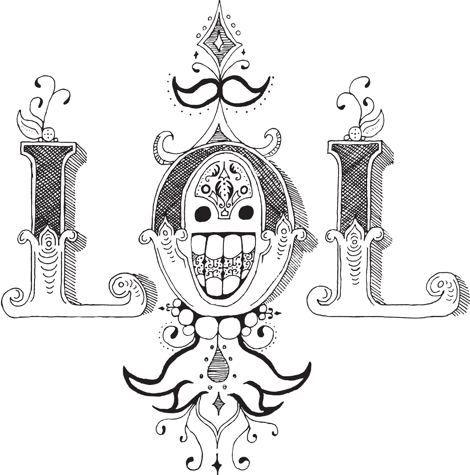
Type Tattoo Week! Day 1: LOL

I put my heart and my soul into my work, and have lost my mind in the process. LOL.


I'm back in school! And the first assignment for my new Advanced Typography class has been to design typographical tattoos. So I'm going to post a week's worth of those to get us back in the swing of things.

This might look familiar. It's sort of an extension/reimagining of the ROWA concept from an earlier typography project. I chose the LOL mark because I've always been fond of it's semi-symmetry and the cute little happy face incorporated into the center. However, in the process of drawing it larger I've somehow made it much, much creepier. So that's a life choice I have to live with now.

Thursday, May 8, 2014

The Roaring Five-Years-From-Now

Vignette is a fun word.

This was past of an art history project, the assignment was to create an educational product that could be sold in a museum gift shop to teach people about a particular movement. Hence this art deco desk calendar. It's chock full of all kinds of lovely prints and fantastic information about the era, the art, and the legacy of art deco.

Don't be ridiculous you don't need to write things on calendars and if you do white pens exist.

Habanas Quality Gloves. For all your finger-coating needs.

Poster in this image is © Art.com and Steve Forney. Used non-commercially in an academic setting.

Tuesday, April 8, 2014

Like Grains of Sand

I've been working on a 2D platformer-type game for a bit now. It's a school project, but it's also a concept I've had in the back of my head for a while. This is a thing I drew today for that thing I mentioned a few sentences ago. Please view it with your eyes.

Grains of sand as in hour glass which keeps time and grains of sand as in grainy pixels, each a tiny piece of a gigantic whole. It's a clever title I swear.

Five shades of gray and some little color accents that I may or may not keep. I've always had a fascination for clock towers, and I'm happy to report that nothing has changed.

Sunday, April 6, 2014

World Domination Made Easy

The Uchukira Corporation is proud to announce that How to Assemble Your New Doomsday Device has won first prize in the animation category at the Take 5 Film Festival!


Here are some production notes if you're into that kind of thing.

A successful doomsday device must have many exposed wires and a large amount of bubbly liquid. It's just science.

Friday, April 4, 2014

I'll Make You a Pizza You Can't Refuse

There's a pizza place nearby with a mafia theme. Their current menu doesn't really suit their restaurant - it's built around buffet and delivery orders, but finding a way to order the pizza you want is a bit of a mess. It lists all kinds of things you don't need to know while in the store and things that don't do you any good outside the store, like the contents of the salad bar and the drinks available at the drink fountain. Here's the original for comparison.

Their little mafioso logo is only pink on the online menu, and for the life of me I can't figure out why.


I redesigned and streamlined their menu, turning it into a tear-away notepad. The focus was on user experience, and I wanted a design that would be easy for the customers and cooks to interact with. This menu explains everything you need to know about building a pizza with little pieces of mafia theming sprinkled throughout. I also redesigned the logo while I was at it.

The Beast Stands
The Beast Falls


The Beast is Skinned

Sunday, March 23, 2014

How to Assemble Your New Doomsday Device


Congratulations on your new Uchukira™ Doomsday Device! Here's a handy video on how to easily and quickly assemble the most reliable planet killer on the market today. Brought to you by the Uchukira Corporation.

Uchukira: World Domination Made Easy™

This is a project that I've been working on for the last few days. The student film festival from last year is coming up again, and I managed to find out about it a whole week in advance this time!

I decided to do the animation in PowerPoint again, because I'm still pretty familiar with the software and I don't animate enough to buy any actual animation software. Here's a slide from the original PowerPoint and another excellent case study of why PowerPoint is not made for animation.

Each one of those lines is a single bubble, and that's not even the most complicated thing on this slide.

The film festival is on April 4th, so I'll let you know how it turns out. Wish me luck!

Saturday, March 8, 2014

Curves and Lines


You know those times when you want to convey a certain feeling in text and none of the fonts you look at convey that feeling so you make the font yourself?

I'm right in the middle of that.
 

Graphic design of the words "graphic design." I am aware of the meta.Lern to Kern

Fact: Business cards don't need phone numbers.


Right now I'm building all the characters in Illustrator out of circles and lines and using pathfinder selections to selectively add and remove elements.
As you may have guessed, this is for a business card. For the time being I'm just building the words I need ad hoc, but someday when I have some more free time I might expand this out into a complete font. It's got a cool, clean geometric feel that I really like.