Showing posts with label typography. Show all posts

Sunday, January 18, 2015

Rainbow Bradbury

(I am so sorry for that title.)


I made a thing! More specifically, I made a series of things. Even more specifically, I made a series of three posters featuring inspirational quotes from science fiction writer Ray Bradbury. And look! They line up all fancy-like!

 Zigs!Zags!Zips!

The goal was to give it a 70's futurist feeling, and to that end I took heavy inspirational draws from early Atari ads. It's simple, but I'm fond of the effect.

Thursday, October 2, 2014

An Absurd Memory

Blind in Life - Blind in Death

New assignment! This is one of the first projects we as students have done for an outside client. The goal was to capture the essence of seven short plays by renowned playwright Samuel Beckett for an upcoming performance at Johnson County Community College. The plays include:

Act Without Words II: In which two people of disparate personalities are stored in sacks.

Ohio Impromptu: In which an old man reads from a cryptic tome to an old mute man.

What Where: In which there are only five left of a group of four men.

Play: In which three burial urns take turns spinning yarns.

Come and Go: In which three women sit on a bench.

Breath: In which there is breath.

Footfalls: In which a sick child either exists or does not.

Death and confusion play major roles in each performance, which is why my main graphic consists of a sightless skull. The icons overlaid on top represent imagery from the individual acts. They are loosely joined by broken, ashy lines, implying the thematic ties that necessarily join each, but only in a superficial - or broken - nature.

Bring your kids!

Thursday, August 28, 2014

Type Tattoo Week! Day 6: Look & See

Look. See. Take a look-see.

Much rougher, much less type, but I've discovered recently that I'm pretty fond of creepy tattoos.

The idea with these is that one would be applied one to each palm.

Wednesday, August 27, 2014

Type Tattoo Week! Day 5: Shall Pass

True for all tattoos, excluding those on very well-preserved mummies.

Did I mention that the project is to design a henna tattoo? Because that detail is important to note for this pun.

Tuesday, August 26, 2014

Type Tattoo Week! Day 4: Above

I like drawing scrolls.

More tattoo motifs! The typographic focus in this one is mainly the letter spacing and thin slab serif style.

The words mean nothing but are vague enough concepts to mean quite a few things. So that's nice.

Monday, August 25, 2014

Text Tattoo Week! Day 3: Ampersand

Ampersand is a truncated form of the term "and per se and," which is neat.

When designing the most generic typographic tattoo, it helps to use some of the most generic tattoo motifs. Hence this half-filled ampersand.

Sunday, August 24, 2014

Type Tattoo Week! Day 2: Still

Still breathing. Still here. Still alive. Still fighting. And yet - still standing still.

I chose this word for the second tattoo mainly because of the anatomy of the type. The lower finials of each of these letters forms a neat little hook motif that I think works well with the idea of stillness - keeping things in place and all.

Saturday, August 23, 2014

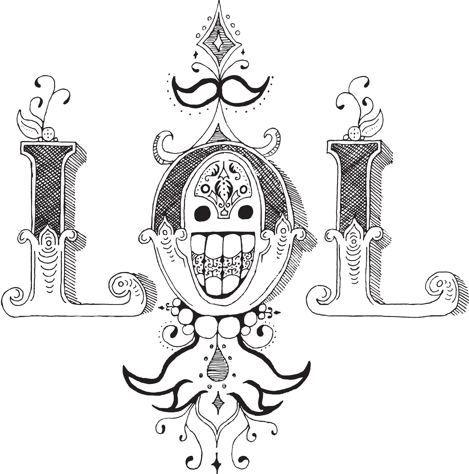
Type Tattoo Week! Day 1: LOL

I put my heart and my soul into my work, and have lost my mind in the process. LOL.


I'm back in school! And the first assignment for my new Advanced Typography class has been to design typographical tattoos. So I'm going to post a week's worth of those to get us back in the swing of things.

This might look familiar. It's sort of an extension/reimagining of the ROWA concept from an earlier typography project. I chose the LOL mark because I've always been fond of it's semi-symmetry and the cute little happy face incorporated into the center. However, in the process of drawing it larger I've somehow made it much, much creepier. So that's a life choice I have to live with now.

Saturday, March 8, 2014

Curves and Lines


You know those times when you want to convey a certain feeling in text and none of the fonts you look at convey that feeling so you make the font yourself?

I'm right in the middle of that.
 

Graphic design of the words "graphic design." I am aware of the meta.Lern to Kern

Fact: Business cards don't need phone numbers.


Right now I'm building all the characters in Illustrator out of circles and lines and using pathfinder selections to selectively add and remove elements.
As you may have guessed, this is for a business card. For the time being I'm just building the words I need ad hoc, but someday when I have some more free time I might expand this out into a complete font. It's got a cool, clean geometric feel that I really like.

Thursday, February 27, 2014

It's the Bombe


 Cryptography! Or as my great-grandpa used to call it, fubswrjudskb!

This has been an ongoing project for my layout design class, and it's finally getting to a point where I'm ready to call it presentable. The project is to construct a tritone newsletter for a non-profit organization. While my classmates are off raising awareness for worth-while organizations like the WWF or GlobalH2O, I decided that I like word puzzles and made a newsletter for non-profit hobby organization the American Cryptogram Association.

The neat thing about making a newsletter for a group dedicated to hiding messages in things is that you get to hide a bunch of messages in things. Take this logo, for example.

Boom! It's BOMBE!

This logo is a rotational cipher for the word BOMBE, which is a reference to the machines used to crack the Nazi ENIGMA codes during World War II. If you take 360 degrees and divide it by 26 (letters of the alphabet), you can assign a different letter to each distinct point on a circle. I indicated this by the point on the circle that doesn't have a triangle on it. The outer ring is B, the next ring is O, and so on. The result is a neat little explosion with a neat little hidden message.

It's rain because it's April. April showers. It used to be ferns but then I learned there's no such thing as April ferns. They all disappear at the end of March.

This is the cover! The main focus here is the tritone coloring - only the colors used in the entire document are the red, orange, and blue shades along the left edge. The dark brown is a combination of all of these colors, and the raindrop imagery is just lighter and lighter shades of blue. In theory, this entire newsletter could be printed with just three inks.

Seriously, who broke this ENIGMA machine? This thing is crazy expensive.

And here's the interior spread! It's very busy, very rigid, and very wordy, just like cryptography. Because this composition is for a hobby organization, I wanted to include articles and information that would be interesting to casual cryptographers. This is a bit of a departure from the philosophy of the ACA, but its accessibility is perfect for bringing in new members and keeping current members informed and entertained.

Friday, November 1, 2013

ROWA Theatre

What do I doodle in typography class, you ask?
Be Right Back

Laugh Out Loud

Oh My God


What/Ever


You Only Live Once
What The F---

Ridiculously Ornate Web Acronyms.

This concludes today's presentation of ROWA Theatre. Thank you for joining us, and have a pleasant evening.

Thursday, October 17, 2013

Responsible Design

Remember kids, writing is dangerous.

Luba Lukova is a wonderful graphic designer who makes wonderful posters and prints along the theme of social justice, and as part of a class assignment I've made this fake exhibition poster for her.

The illustration and type was all drawn by hand and arranged/recolored in Photoshop.

The illustration depicts a hand gripping a large pencil.

The type uses letter forms spaced closely together to form groupings known as words.

I'm learning so much here.

Thursday, September 12, 2013

Every Expression of Endless Envy

EEEEEEEEEEEEEEEEEEEEEEEEEEEEEEEEEEEEEEEEEEEEEEEEEEEEEEEEEEEEEEEEEEEEE

I made a poster in typography! We were given one hour to pick a typeface, come up with a concept, and use freehand marker skills to turn in into a finished poster that displayed five qualities of type anatomy. Naturally my first instinct was to make Pac-man screaming/eating Helvetica Es in a spiral formation.

Naturally.