Showing posts with label pen. Show all posts

Thursday, August 28, 2014

Type Tattoo Week! Day 6: Look & See

Look. See. Take a look-see.

Much rougher, much less type, but I've discovered recently that I'm pretty fond of creepy tattoos.

The idea with these is that one would be applied one to each palm.

Wednesday, August 27, 2014

Type Tattoo Week! Day 5: Shall Pass

True for all tattoos, excluding those on very well-preserved mummies.

Did I mention that the project is to design a henna tattoo? Because that detail is important to note for this pun.

Tuesday, August 26, 2014

Type Tattoo Week! Day 4: Above

I like drawing scrolls.

More tattoo motifs! The typographic focus in this one is mainly the letter spacing and thin slab serif style.

The words mean nothing but are vague enough concepts to mean quite a few things. So that's nice.

Monday, August 25, 2014

Text Tattoo Week! Day 3: Ampersand

Ampersand is a truncated form of the term "and per se and," which is neat.

When designing the most generic typographic tattoo, it helps to use some of the most generic tattoo motifs. Hence this half-filled ampersand.

Sunday, August 24, 2014

Type Tattoo Week! Day 2: Still

Still breathing. Still here. Still alive. Still fighting. And yet - still standing still.

I chose this word for the second tattoo mainly because of the anatomy of the type. The lower finials of each of these letters forms a neat little hook motif that I think works well with the idea of stillness - keeping things in place and all.

Saturday, August 23, 2014

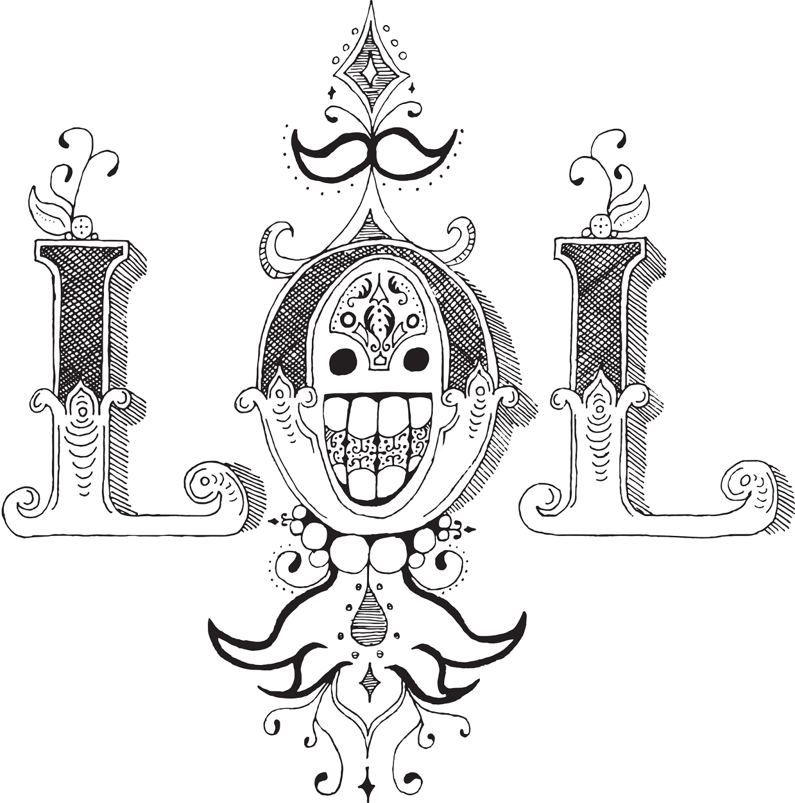
Type Tattoo Week! Day 1: LOL

I put my heart and my soul into my work, and have lost my mind in the process. LOL.


I'm back in school! And the first assignment for my new Advanced Typography class has been to design typographical tattoos. So I'm going to post a week's worth of those to get us back in the swing of things.

This might look familiar. It's sort of an extension/reimagining of the ROWA concept from an earlier typography project. I chose the LOL mark because I've always been fond of it's semi-symmetry and the cute little happy face incorporated into the center. However, in the process of drawing it larger I've somehow made it much, much creepier. So that's a life choice I have to live with now.

Monday, November 11, 2013

Mr. Lemmon

What a day it is to be a collection of lemon sketches...

The air was crisp. The wind rustled the sparse leaves overhead as Johnathan Lemmon dug his chin deeper into the scarf he had wrapped around his neck as he left the house that morning. By now his morning routine had fallen into the background of his consciousness, a blur of repetition that had been slowly and carefully crafted throughout the autumn months only to become entirely unnoticeable. Jelly on toast. Keys in pocket. Jacket on. Scarf around neck. Front door locked. Walk to work.

His routine had never failed him, and with no reason to inspect it closer, Mr. Lemmon let his instincts guide him out into the crisp autumn air each morning, forgetting each step almost as it happened. He had developed a comfortable inattention, and ultimately, it would be this very same inattention that would place his foot in the unusually large crack that had appeared in the sidewalk the previous night, this same inattention that would keep his hands in his jacket pockets until it was too late to break his fall. He had almost begun to notice something amiss when his head met the pavement, after which he lost consciousness and stopped paying attention to much of anything.

Johnathan Lemmon began to pay attention. And what he noticed surprised him. Upon waking from his unexpected collapse, Johnathan Lemmon had become, quite remarkably, a collection of rough lemon sketches.

His morning routine would have to wait.

Wednesday, May 8, 2013

Happy Birthday Shan!

Today marks a very special occasion, the birthday of a very special person, who is celebrating a very special milestone in her very special life. So I made her this very special hand-drawn card that looks like a very special expressionist sketch.

And that's pretty neat.

No two areas that touch directly are the same color. If you have time, look up Four Color Theorem on Wikipedia. Interesting map coloring stuff.

Wednesday, April 24, 2013

Janice Did Not Die in Vain

It's official! Last night at the film festival, Paradium and You won 1st Place in the Animation category and the overall People's Choice prize!

I wasn't able to make it to the screening until about an hour in, so I missed the third- and second-place winners in animation. I went in not knowing if I had received a previous prize or if I had even been considered for the category. Seeing my name and the title of my animation up on the screen was an absolute shock, and I'm still sort of riding that phenomenal buzz today.

This is really exciting. I was honestly not expecting to win - not for lack of trying, but for lack of time. As I've previously mentioned, I found out about the festival three days before the deadline and I was using probably the worst possible program for the job.

However it happened, I won, and I'm pretty darn stoked about that.

Just so this whole thing isn't text (or at least type), here're the production notes. I think it's kind of cool to see what certain bits look like in relation to the finished product, so if you're into that too, here's my brainstorm process. If you're not really into that, there are some doodles of Janice in there too. Your boat floats in a manner known only to you.

And yes, I am aware that my handwriting is a masterpiece of typography. Please stop flooding the comments with your praise.

Organization!