Showing posts with label color. Show all posts

Thursday, December 4, 2014

Soy Inks

As opposed to all those inks made from baby otter blood.

You wanted to know things about inks made from soy? Here's a poster that explains that. You can click on it to enlarge the image and read it better, if that's your thing.

I'm not sure why I made this.

Tuesday, November 26, 2013

Lace Chromata

I have been staring at this for hours and I've either gone crazy or fallen in love. It's hard to tell.

I've done it. I've colored the pattern. And it's pretty spectacular.

To make this image, I used color sequences from Munsell's color space. This system accounts for changes to three main variables: hue (the color), value (the brightness of the color), and saturation (the amount of gray in the color).

I really want you to get the full impact of how beautiful this thing is to me, so let me walk you through the five main components:

Le Petit Fleurettes

This is a circular progression through Munsell color space, beginning at the bottom left and extending up to the top right. Note how all the colors represented are the same value and saturation, but all the hues are changing in the order that they would in a typical color wheel.

Le Petiter Leafettes

This is a diagonal progression through a single hue of Munsell color space, beginning at the top and extending downwards. A diagonal progression keeps the same value and hue throughout, but gradually adds more and more gray to the base hue.

Le Even Petitier Seedthingyettes

Le... Pollen? Ettes? 

These two progressions actually use a horizontal motion, but with different hues in each. A horizontal progression means that the color keeps the same hue and saturation, but gradually changes value. In the top example, the base hue is red on the right. Each step moving to the left is another step down in value. In the bottom example, the base hue is on the left and moving right with subsequent steps up in value.

 Le Whatever

Finally, from top left to bottom right, we have the diagonal cross-section sequence. This one gets a little more complex, because we have two variables shifting: hue and value, with the base hue (orange) moving both across the color space to it's compliment (blue-purple) and down in value. The result is a calming transition that avoids creating any of the chromatic gray shades that usually pop up when going from a hue to its compliment.

So knowing all that, join me once more in gawking at how these simple lines drawn through the visual spectrum can be woven together into a magnificently complex tapestry of color.

Awesome.

Wednesday, October 16, 2013

Driving the Duotone Diner

I love the fake return address on this: Darneder Truss is an anagram of "Return Address," 122 is OCT code for R, 116 is N, so the rest of it reads: REturn aDr.Ess re,TURN. So much yes.

Remember that Food Truck Festival poster I made a while back? One of the concepts is back as a sexy two-tone postcard for my Technical Processes class! The entire image is made from nothing more than Pantone Bright Red, Pantone 357 Green, and some various mixes of the two. These colors were picked because they're very common food colors that mix to a nice, healthy brown.

That prominent printing edge makes me feel all warm and fuzzy inside and I'm not totally sure why but I think I'm okay with that.

I've always really liked limited palettes, if for no other reason than because there are only so many ways you can solve it. With total creative freedom, there's always the chance that whatever you do, no matter how brilliant, isn't utilizing the full available potential. This is just simpler. And it's lovely.

Monday, October 14, 2013

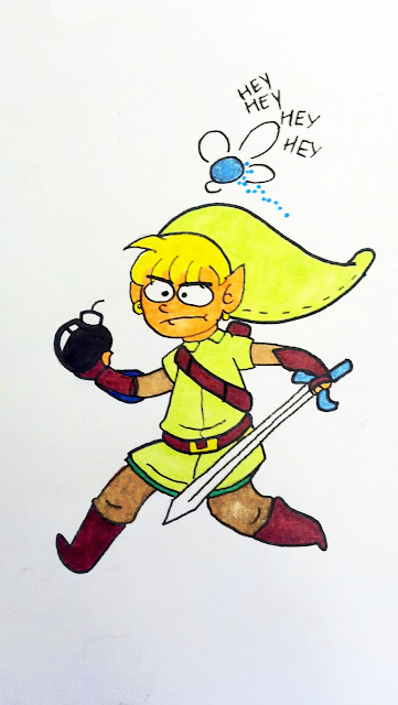
Hey!

I enjoy doodling. It has a lot of practical applications, from organizing the thought process to developing an early concept to relieving boredom.

Someone - I have no idea who - drew all these lovely little pencil sketches on the table liner at a nearby desk.

All these wonderful expressions and Catbug's just doin' his usual thing, huggin' some toast.

So, being a connoisseur of fine doodles and the owner of several pens and markers, I took it upon myself to ink and color one of the more interesting ones.

"One of these days, Navi. There's gotta be a bottle around here somewhere..."


Again, I didn't draw this, and I have no idea who did, but I certainly enjoyed coloring it in, and I think the finished sketch has a lovely, cartoonish quality to it, and it was fun to translate certain elements into a more color-friendly environment.

Tuesday, October 8, 2013

Painting Wonder Woman

Color Theory class at this school involves a lot of painting. Subsequently, if I want to demonstrate that I know what primary colors are and pass this class, I have to learn how to paint. It's like the worst sitcom ever.

Here's Wonder Woman.

I don't read comics so I don't know what Wonder Woman talks like or if she has any catch-phrases or anything but if I did know those things I would put them here.

Here's a chunk of Wonder Woman's face using only blue values.

You know what I'm just gonna pretend I know these catch-phrases since no one could possible call me out on misquoting Wonder Woman: "Gadzooks! My flimflamity face has been paintulated! Blazes!"

Here's that same chunk of Wonder Woman's face using a chromatic triad.

"Paintulated again! Those confounded hooligans must be reckoned with! To the Imperceivable Flying Contraption!"

Monday, September 23, 2013

Tendrils and Doodles

I doodled some non-euclidean monstrosities! Then I quickly live-traced them into vectors! Yay vectors!

Wriggling and writhing erratically about the page.

There's another squid in the above image I didn't use! Guess why!It just looks so soft and cuddly!

Tuesday, September 10, 2013

Posts or Lack Thereof

Back in the early days of design, pioneers had to construct their own unresponsive program indicators.


So this is what I've been doing in school lately.

Arranging color wheels.

I haven't been posting much because there's not much to see here.

It's a color wheel.

I arranged it.

Go me.

Sunday, September 1, 2013

Level Caps

Anyone else find this animation weirdly soothing?

All 40 color variations on a logo I've been making lately. Hand-lettered, designed from scratch. Learned about dithering as a shading method and ever since I've been much happier.

Also, here's a sprite sheet of my design process.


Pixel hats yaaaay.