PowerPoint can be used for animation. It probably shouldn't, though.
Paradium and You - The Citizen Guide to Safety came out yesterday. It was initially done as an animation entry to my local film festival and slowly, through hard work and determination, became the same thing but completed a bit too far past the deadline.
I didn't really have any place to enter a film festival. I'm an ex-culinary student who switched majors to pursue graphic design two months ago, and neither of the fragmented educations I have received thus far have prepared me for the world of competitive short film making. But I saw a poster for the festival on the day of the deadline, determined that if I could throw anything at all together in the four hours I was allotted it'd be a miracle, and decided that amateur speed cinematography sounded like a fun way to spend an afternoon. And of course, in the absence of proper animation software or common sense, I figured the fastest thing to do would be to make an animation in PowerPoint.
If I've learned one thing, it's this: PowerPoint is not appropriate software for animating.
I've previously pointed out that PowerPoint can export to video. This is a wonderful feature if you're looking to put a slideshow on YouTube. It is a terrible feature if you're trying to animate, because it lulls you into believing that if you can make a good bulleted list, you can make that list dance.
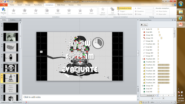
Take Janice, the only animated character in the five minute animation that can honestly be said to be animated, and that's if we're being fast and loose with our definition of honesty. Janice is on screen for a minute and forty seconds. During this time, she waves, blinks, has an x-ray look at her bones, shakes in nervous anticipation for twenty seconds, and collapses over dead. She doesn't walk around, doesn't turn her head away from the camera. This is her animation sequence in PowerPoint.
Can you understand what's going on in there? I made the thing and I can't understand what's going on in there.
The problem with animation in PowerPoint is that it doesn't support frames. Every shape from every second is in your work area at once, stacked in the order in which it will appear on screen. You can't even move things out of your way, because doing so effects how that shape will appear in the final product.
And the range of animations you can apply to any given shape is decently varied, but you have to bend it and wrestle with it to get anything to do what you want. See in the above image, those black bars in the animation pane on the right? That's a spin effect. In order to get Janice to shake in horror, I had her dress spin 0.5 degrees clockwise in a span of 0.1 seconds over and over and over again. It was possible to do, and the effect turned out looking alright, but I can't help but feel like there had to be a better way to do that.
I don't animate often, and I don't animate particularly well, so I don't know how common vector shape animation is, but that's all you can do in PowerPoint. That's why I keep talking about putting effects on shapes. If you want something to move, you've got to make that something a smart object and give it a set of choreography instructions from a predefined list. There's plenty of customization within that list (a shocking amount, actually. Like I mentioned, you can make fear quivers from spins). But it ultimately feels like it's more geared for text effects. Like some sort of presentation software or something.
I'm expecting too much from PowerPoint. Just because it can be used as a vector drawing program doesn't mean it should be. And just because it can be used to make fancy WWII era dark-comedy animations doesn't mean it's the best tool for the job. It fact, it's probably one of the worst. It's like an artist who dedicates his life to creating portraits in bottle caps. They may be wonderful portraits, but ultimately it's an unnecessary and somewhat silly limit to put on an artist.
So yeah. I guess if every you felt the compulsion to make animations in PowerPoint, the lesson here is don't. Use different software. It's probably easier and the results will probably be better. I'm not really sure what other audience I could possibly be writing this for.


No comments:
Post a Comment