Tuesday, October 22, 2013

The All Hallows Project! Day 3


"The Wild Hunter." And that's how I developed respect for whoever it was that designed the illustrations for playing cards!"Disappear." With a face like that, you have to be fashionable."Dead." 100% hand pixel'd in MSPaint.

 Click to Enlarge, Igor!

And here we have the Headless Horseman (German), Zombies (Japanese), and The Invisible Man (Norwegian).

Low-res pixel art sorta loses its impact when the image itself is tiny, doesn't it?

Monday, October 21, 2013

The All Hallows Project! Day 2

"Skeletal." This one took far longer than it should have, but I like it. There's something inherently skeletal about line drawings."Hydra." A little more cutesy today. Every kid on the block will want one! Which should be pretty easily accomplished, provided you can dodge those teeth and get a clean cut on the neck."Man is a Wolf to Man." Another exagerated self-shot, made all the more sinister by woodcut engraving. And wolf fangs. Those are sinister too, I guess.

I Was a Teenaged Click to Enlarge

The All Hallows Project continues with Hydra (Greek), Werewolf (Latin), and Skeleton (Spanish)!

As an aside, these were all done in PowerPoint, before I was introduced to Illustrator. It's incredible to look back on these, knowing what I was able to accomplish with such limitations.

Sunday, October 20, 2013

The All Hallows Project! Day 1

"This is a ghost that will lick you." Off to a really strong start with these captions."Grotesque Disarrangement." Lots of fun stuff about this picture. The face is my own, the gray splotches are pictures of various cuts and wounds, and the background is a low-brightness shot of open heart surgery. Sleep tight!"The Climbing Spider." Some people claim spiders aren't proper monsters. To these people, I would like to point out the skyscraper this spider is climbing.

Click to Enlarge, IF YOU DARE!!!

Presenting for the first time on Pixeldin, the All Hallows Project! A series of 31 monster posters I put together in October of last year to celebrate the approach of Halloween.

Last year I had enough free time to make one poster per day. I planned to do the same thing this year, creating an entirely new poster on the same theme just to show how much my skills have improved. But seeing as it's the 20th and my assignments are just now starting to ease up enough to actually post the old series, I guess that's not happening.

First up! Ghost (Italian), Spider (Dutch), and Frankenstein's Monster (French)!

Saturday, October 19, 2013

The Adventure Begins!

Let's a-go!

Here's some stuff for a thing I'm doing!

I was sketching out some pixel sprites, and I liked them so much that I figured I might as well make a game out of them. What kind of game is still sort of up in the air, but I'm leaning towards puzzle-platformer.  

The last time I coded a game from scratch was in middle school, so I'll be interested to see if I can still do things. Relearning all this stuff is going to be time-consuming work, and obviously my school work takes precedence, so I have no idea when I'll have this completed!

Stay tuned!

Friday, October 18, 2013

Poison Apples

I'll share a secret with you. This is no ordinary apple, it's a magic wishing apple...

These apples have been poisoned with the cruelest cinnamon, the vilest vanilla, the rudest rosewater, and lots of sugar. Really pleased with how these turned out, I'll have to get some better pictures when you cool down.

Thursday, October 17, 2013

Responsible Design

Remember kids, writing is dangerous.

Luba Lukova is a wonderful graphic designer who makes wonderful posters and prints along the theme of social justice, and as part of a class assignment I've made this fake exhibition poster for her.

The illustration and type was all drawn by hand and arranged/recolored in Photoshop.

The illustration depicts a hand gripping a large pencil.

The type uses letter forms spaced closely together to form groupings known as words.

I'm learning so much here.

Wednesday, October 16, 2013

Driving the Duotone Diner

I love the fake return address on this: Darneder Truss is an anagram of "Return Address," 122 is OCT code for R, 116 is N, so the rest of it reads: REturn aDr.Ess re,TURN. So much yes.

Remember that Food Truck Festival poster I made a while back? One of the concepts is back as a sexy two-tone postcard for my Technical Processes class! The entire image is made from nothing more than Pantone Bright Red, Pantone 357 Green, and some various mixes of the two. These colors were picked because they're very common food colors that mix to a nice, healthy brown.

That prominent printing edge makes me feel all warm and fuzzy inside and I'm not totally sure why but I think I'm okay with that.

I've always really liked limited palettes, if for no other reason than because there are only so many ways you can solve it. With total creative freedom, there's always the chance that whatever you do, no matter how brilliant, isn't utilizing the full available potential. This is just simpler. And it's lovely.

Tuesday, October 15, 2013

Eye Popping

If your eyes are bigger than your stomach you;re gonna have issues.

It has been a long, long time since I last made cake pops. Which is why I'm really pleased with how these turned out. They're made from red velvet cake, so when you bite into your tasty eye-on-a-stick you get a mouth full of red gunk! I love Halloween, it's so festive.

They were made for a Halloween party coming up this Thursday. I'm working on a lot more tricks and treats this week, so I'll be sure to keep you posted.

Monday, October 14, 2013

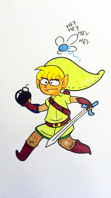
Hey!

I enjoy doodling. It has a lot of practical applications, from organizing the thought process to developing an early concept to relieving boredom.

Someone - I have no idea who - drew all these lovely little pencil sketches on the table liner at a nearby desk.

All these wonderful expressions and Catbug's just doin' his usual thing, huggin' some toast.

So, being a connoisseur of fine doodles and the owner of several pens and markers, I took it upon myself to ink and color one of the more interesting ones.

"One of these days, Navi. There's gotta be a bottle around here somewhere..."


Again, I didn't draw this, and I have no idea who did, but I certainly enjoyed coloring it in, and I think the finished sketch has a lovely, cartoonish quality to it, and it was fun to translate certain elements into a more color-friendly environment.

Tuesday, October 8, 2013

Painting Wonder Woman

Color Theory class at this school involves a lot of painting. Subsequently, if I want to demonstrate that I know what primary colors are and pass this class, I have to learn how to paint. It's like the worst sitcom ever.

Here's Wonder Woman.

I don't read comics so I don't know what Wonder Woman talks like or if she has any catch-phrases or anything but if I did know those things I would put them here.

Here's a chunk of Wonder Woman's face using only blue values.

You know what I'm just gonna pretend I know these catch-phrases since no one could possible call me out on misquoting Wonder Woman: "Gadzooks! My flimflamity face has been paintulated! Blazes!"

Here's that same chunk of Wonder Woman's face using a chromatic triad.

"Paintulated again! Those confounded hooligans must be reckoned with! To the Imperceivable Flying Contraption!"