Thursday, February 28, 2013

Prairie Snapshot Week! Day 4

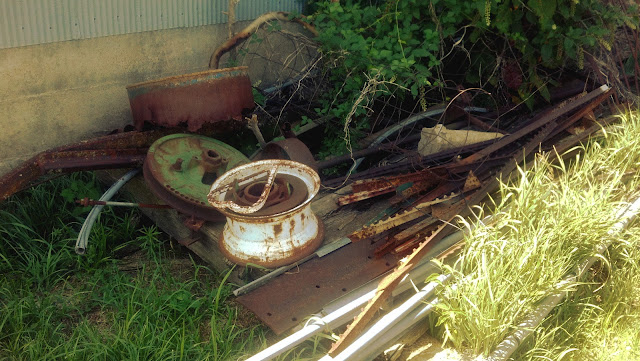
Rust and brush.


My grandfather was a cattle rancher. Part of his brand was a lazy heart, which in cattle branding terms means a heart lying sideways. Think <3.

The rusted heart in this overgrown pile of scrap was part of a sign on an old pasture gate. The other half of the brand is possibly still in that pile somewhere, but I've never been able to find it.

Wednesday, February 27, 2013

Prairie Snapshot Week! Day 3

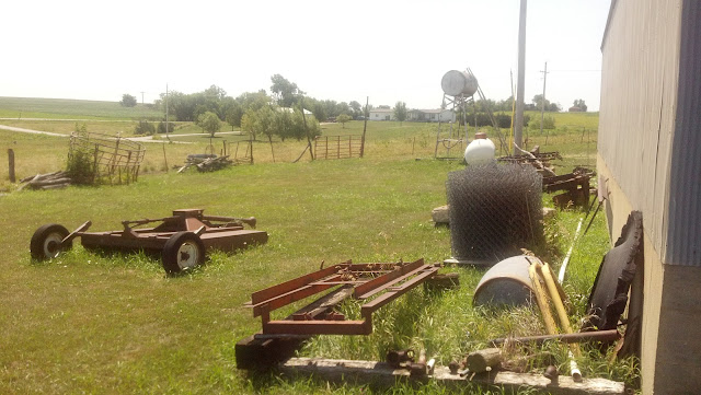
Jump the fence, will you? Well let's see if you can jump a BALE OF FENCE!

The yard behind the shed. Items pictured, listed from top left to bottom right passing through upper middle and dead center with branching paths leading to the northwest, southwest, and southsouthwest, respectively in a counter clockwise direction: Mechanical lawn mowing tractor attachment, gasoline tank (on stilts) and propane tank (on ground), bale of chain link fence, rusted barrel, detached tire face, assorted wood and metal.

Tuesday, February 26, 2013

Prairie Snapshot Week! Day 2

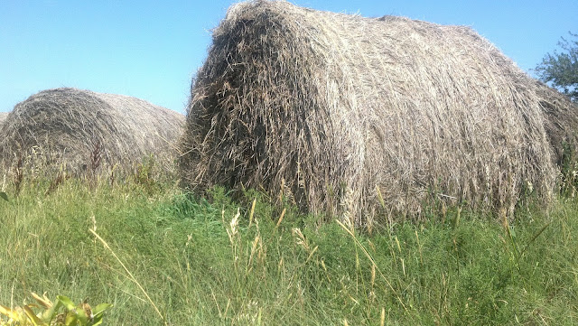
Round haybales are superior to square ones. How do those square ones even roam?

Here we see a pack of wild hay bales. These noble beasts roam the endless fields of Kansas in search of fodder. This is a younger pack, their silver coat still untarnished by the yellowish mold that sets in after many months wandering amidst the elements. This photo is one of the closest ever taken of the haystack in the wild, so close that the thin lines of natural twine can be seen along the pack leader's side. Simply remarkable.

Monday, February 25, 2013

Prairie Snapshot Week! Day 1

It's that time again! I forgot to post for a couple days and now I'm panicking about the lack of recent content on the site! So we're going to try another week-long series and hope everything sorts itself out in the long-run.

This week, we'll be taking a look at an album of pictures I took while visiting my grandparents in Kansas. This was my first attempt at artistic photography and to date some of the best pictures I've ever taken.

First off, here's a small wind-blown peach tree on the border of an old cow pasture at high noon.

Kansas.

Now that's just peachy.

Thursday, February 21, 2013

The Spy's Guide to Omegle

Omegle is crazy. It's a one-on-one conversation with a complete stranger that can lead to some of the funniest, deepest, most heartfelt, most disturbing, or just plain entertaining communications you can have with another person. It's seen some decline in recent years, and you have to work a bit harder to have a worthwhile conversation, but once you get it going, it can be a fantastic place to kill a few hours.

A while back, Omegle introduced Spy Mode, which allows a third person to ask a question at the start of the conversation and watch as two strangers discuss it. I had plenty of fun with that, and compiled some of my favorite responses into a handy guide.
You just caught Stranger cheating on you! Confront them!

Wednesday, February 20, 2013

Shade Shading

Now what would a powerpuff girl need an umbrella for?

One of the final projects for my Intro to Illustrator class involved 3D rotation to make some simple models, like chess pieces and glass bottles. I decided to do a bit of extra credit and made this here girl holding an umbrella. Because if I'm about anything recently, it's girls holding umbrellas.

Monday, February 18, 2013

Storm's a Brewin'


Nights like this.

 
The storm came through and drowned the land.
Took with it all but one.
In the dark she quitely stands
to greet the perished sun.


Sunday, February 17, 2013

It's Raining... It's Pouring...

Waiting... Watching...

I'm not great at figure drawing - even less so on the computer. So when I want to make something with a person in it, I'll usually base it off a photograph or sketch it out on paper. I sketched this lovely lady in pencil, took a picture, and found that it was too washed-out to work with. One catastrophy of auto brightness/contrast correction later and this creepy fog effect appeared.

Hopefully, in spite of this unusual start, the finished product won't be harboring any angered spirits. I'll keep you posted.

Saturday, February 16, 2013

Thrillerman

'Cause this is thrilleeeer...
 
Someone on Reddit pointed out that my enderman looks like he's dancing to thriller.
 
So I made this after revising this.
 
There are a lot of links in this post.
 
I'm sorry for that I don't know what I was thinking.

Friday, February 15, 2013

Imgur is Over Capacity

INSERT TOKEN TO CONTINUE! 10! 9!

So it looks like after two years I've finally gone over the limit on the free account I have with Imgur. That's the image host I use to post things to this site and stuff like Reddit. So now I have to decide whether or not to pay the $25 annual fee for unlimited hosting or find a new host to fill up.

This is news, right?

An Orderly Fashion

Image 1: Fuzzy
Or stabby, depending on your interpretation.

Image 2: Eliminate
I think I built sort of a landscape in the combination panel and I think it looks kinda awesome.

Image 3: Floorplan
This house has no doors what?

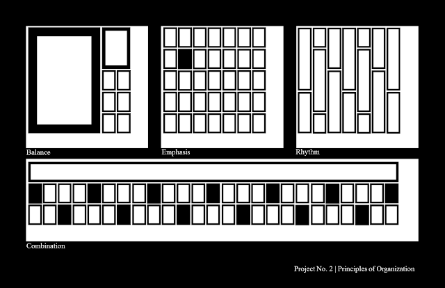
We had another four-panel assignment recently, this one on the principles of organization, or the way a design is divided between subjects and whitespace. As it was taught in this class, though, there are only three principles, so the fourth panel went to a combination of all the other principles.

Balance: Balance is probably the most common way of organizing an image. It refers to the amounts of each element in relation to each other. Image1-Panel1 creates a balance between internal and external with a dividing line of elements. Image2-Panel1 introduces an unusual balance, dividing the image between a defined but less prominent series of crosses opposed to an open, empty field of whitespace. Symmetry is a form of balance, but asymmetrical balance can be achieved a number of ways, such as using one large object used to balance several smaller ones, as seen in Image3-Panel1.

Emphasis: This is the way elements are arranged on a page so as to draw the eye into a certain area. The focal points in all the emphasis panels are very clear. In Image1-Panel2, the eye is drawn to the center of the various spokes, where the higher contrast sets it apart. Image2-Panel2 brings the eyes immediately downward to the heaviest concentration of shapes. And a break in the otherwise uniform field of rectangles brings focus to the dark rectangle in Image3-Panel2.

Rhythm: Rhythm is the defining aspect of a pattern. Anything that repeats in a noticeable way can be said to have rhythm. This is seen in the grid in Image1-Panel3, or the diminishing size and distance between the X shapes in Image2-Panel3. Image3-Panel3 takes a different approach, employing a pattern not of shapes but of a predictable pattern of breaks in each shape.

Combination: I like the combination panels. They're neat.

I'm posting the three I have right now because I really, really don't want to be tempted to do another gestalt week thing. I may miss posting a few days here and there, but it just got so hard to say new things about the same ideas repeated over and over in designs made only to showcase those ideas. So there'll be no organization week. Sort through your clutter on your own time.

Thursday, February 14, 2013

Be MineCraft

♥ Hey there, ssssssssssexy... ♥


Happy Valentine's Day, folks!

So this is the culmination of that project I mentioned earlier. I've got every mob in the game represented here, each with their own cute little double entendre.

Show your special someone that all ten of your hearts belong to them with one of these cards. Individual cards can be downloaded by clicking on the little gear in the top right corner of the above panel. For 8-card sets formatted to fit on 8.5x11" paper (ideal for schools and offices where the sweethearts run amok), click these words.

May your St. Valentinus Day festivities be filled with much chocolate and hugs.

Wednesday, February 13, 2013

Calendar Contest is Go!

"Vote from your boat on a moat with a goat in a coat" is a quote I wrote. Take note.


Voting is now live on the J!NX Calendar Contest! There are a lot of great submissions, and you can vote on all of them here. And my design was choosen to go on to voting! Good ol' Endy and Snowfellow can be found here, any and all feedback and votes are greatly appreciated. This project has been at the forefront of my focus for a few weeks now, so it's both a relief and an excitement to see the final stages finally underway.
 
Best of luck to everyone who entered!


Monday, February 11, 2013

Lush Wildlife

It's been a few days since I last posted. I've got a few projects that are done but time-sensitive so they won't be up for another few days. We are studying a new concept in prinicples of design and I've got a few samples, but I don't want to have another Gestalt Week thing. I'll probably make one post about it and call it that.

Sorry for the inactivity. Here's a duck in a cocktail dress. She's self-conscious, so don't mention her hands.

Quacktail Dress?


Saturday, February 9, 2013

the innocuous

Time-Travel Related News, Since 3912
And here we have a recent composition assignment from school. The prompt was to write about how literacy has affected our lives. Here's that.
 
At the high school I attended, there was an illegal newspaper. the innocuous. It would appear in stacks in the halls at the start of every Tuesday, and before lunch the stacks would be gone. Some were picked up by students to be read and then passed along. Whatever was left was confiscated by teachers to be read and then disposed of. It was a humor publication, satire focused on school events. It was published without names and distributed in direct violation of several school policies. It was a double-sided sheet of 8.5x11” paper, easily hidden among assignments and essays. If you looked carefully, you could spot copies of it slipped into textbooks during classes or being quickly consulted in broken glances in the busy halls. Every now and then you’d hear about some student or other being caught with a copy. I don’t think anyone was clear on what the exact punishment was, and depending on who was telling the story it could be confiscation or detention or suspension. Maybe no one got caught. Maybe the teachers didn’t mind. But it was that sense of danger, that taboo aspect that made that brief weekly report so alluring. Readers got a sense of camaraderie knowing that they were part of a big underground conspiracy. There wasn’t a soul on campus who hadn’t heard of the innocuous, and to my knowledge not a soul who knew the author. At least, if anyone thought they knew, they never confronted me about it. It was senior year, and I didn’t reveal my role in the underground workings of the paper until I had graduated and was clear of any punishment the school could administrate. But whatever effect that paper had on the school, I would be lying if I didn’t admit the significant impact the innocuous had on my life.

I would arrive at 6:45am every day, just after the doors had opened and a solid half hour before the security camera operators would arrive. I carried with me a thick binder filled with school work and two hundred copies of the most recent edition. There were tables scattered around the school, in front of libraries and classrooms. Four of these tables at extreme corners of the school would receive fifty copies each.

The original plan was to have a number of contributors. Set up an anonymous email account, publish it on the bottom of the last page, and let students write in with their stories. In the one-year run of the innocuous, three people volunteered to write and not a single article was submitted. I don’t know what they were expecting to contribute to the newspaper if not news. Maybe they saw themselves as undercover reporters, sneaking around and gathering intelligence to be written up by the journalist types back at the office. As it became more apparent how unrealistic the expectations were of authorship, the contact information at the bottom of the page became  unrealistic as well. It became a parody within a parody, instructing would-be journalists to leave their name and contact info with the hidden microphones around the lockers or with our representatives on the innocuous moon base. By the end of it all every word in the innocuous was mine.

It was having an audience to the project that kept me going. There were thirty five editions of the innocuous published. Two pages a week in ten-point font. It was the longest and most involved written project I had ever attempted. The pace was reasonable on its own, but with the additional strain of a regular school schedule on top it became - at times - overwhelming. Writing a newspaper made me realize the importance of integrity under pressure. It would have been easy to have filled an empty column with lies. At the time no one knew my name, and I had no one to report to but my overworked self. It was as pure an ethical dilemma as I could imagine, and one I’m glad I had to face. I learned that the integrity of a written work matters regardless of any name attached to it. I cared about what people thought of my publication even if I could never publically call it my publication.

I’ve worked on other newspapers since high school. Legitimate ones, ones I can put on a résumé. I’ve served as a reporter, a journalist, a layout designer, and a graphic consultant for work I’ve had my name attached to. It’s a different feeling, being known by your name as well as your work. Writing the innocuous has had a significant impact on my life and my attitude towards writing. I learned that a written work should be able to stand on its own integrity, and not rely on the name attached to it.

Friday, February 8, 2013

Melon Drama

A while back there was this trend on Tumblr and Instagram of posting melodramatic pictures of melodramatic writing. The internet, being what it is, responded less than kindly. Which was awesome.

I wanted to get in on this. So I decided to cut out the middleman and make some melodramatic pictures with questionable melodramatic text. Here are those.
Don't listen to the naysayers, lest they say nay and pay bay fishermen.
 
I'll always be someone you can lean on.
 
Arson makes the heart grow fonder.

Thursday, February 7, 2013

Why Design?

In class a few days ago, I was assigned to explain in 800 words why I was interested in graphic design as a career. As I've mentioned before, graphic design wasn't my first choice, and I'm hoping that this essay will explain the process that lead me to where I am today.
I’ve tried very hard to not be a graphic designer. It’s been a career I’ve struggled with for as long as I can remember. Some of my earliest memories of trying to choose a career include the vivid repulsion I had to being any sort of artist. I’ve been sketching and doodling and arranging and designing since childhood, and I’ve always had a deep appreciation for aesthetic beauty. But for some reason that I’ve never been able to fully comprehend I have always had the peculiar belief that a real job is one that couldn’t be done sitting down.

I had lofty goals as a child, as any child does. Science was a constant source of new information and ideas to my younger self, and so I vowed my life and its infinite potential to scientific pursuits. I had grand images in my head of to adventures of field researchers and the construction of fantastic devices. I learned the value of societal contribution in experimentation and the exploration of new ideas. The convictions I formed in my young head were made all the stronger by my childlike wonder for the world around me.

Then I got older. I discovered that other contributions could be made to society outside those of concrete knowledge. The realization of that fact is what would lead to the slow degradation into creativity. I was producing creations at a rate unfit for a realm of evidence. But my peculiar beliefs were as strong as ever. I would not resign myself to design. It was at that time I discovered, quite by accident, cooking. Here was everything I loved about science without the burden of experimentation. I could run about a lab all day performing exact tasks and procedures and not be worried about discovering anything new. All the results I would ever hope to achieve were written in recipes, established little instructions that would guide me to my desired result if only I could provide the skill to achieve them. It was a noble field, and eventually I came to that stage of mid-adolescence when children are told to pick a career path that will guide them the rest of their lives. I began my enrollment at a culinary college.

It was a hell I thrived in, for a time. The instructors were brash and unforgiving. The schedules were as strict as could be allowed. Should a student miss one class period, hours and hours of effort would be cast aside and the student’s grade would drop by one letter mark. A second absence would warrant another dropped letter mark, and a third would signify a failure of the class. There was no allowance made for sick days. It was considered unusual for a class period to pass where the chef instructor would not yell at the students. Speaking during class was restricted to the phrase “yes chef.” If a concern, question, or idea could not be expressed with this phrase, it had no place in the classroom. Students were graded on individual performance and grades were made public to foster competition. The administration allowed for all of this, noting that all of their practices were meant to simulate the working conditions of a true professional kitchen environment.

During my time at that college, I continued to create. Not in the kitchen, for to deviate from the syllabus on any way would have been dealt with harshly. In a way that stifling environment worked to my advantage, because when I went to apply for a graphic design position on the volunteer school newspaper I was the only applicant and was hired on the spot. I assembled graphics, designed layout, helped revise the final editions and – on occasion – wrote articles. Despite my creative outlets, the everyday torment from my teachers and mentors eventually became too much for me. It took me almost two years of constant confusion and anger and helplessness before I decided not to pursue cooking as a career.

I was purposeless for a while after that. My identity had been taken from me; I was no longer a cook. It took three months for me to begin my formal education in my only remaining skill, graphic design. It had always been a hobby for me, never a pursuable career. I’ve never had a job in the graphic design field. Every cent I’ve made from my drawings was made from personal projects that I’d try to sell in pieces. In some ways I still have a difficult time accepting that I will one day be able to perform my life-long hobby in a professional setting. It seems like an arrangement beyond the possibilities allowed by my peculiar beliefs. It seems, in a sense, too perfect.

Wednesday, February 6, 2013

Family Portrait

Cheese doesn't exist, so just say, like, bread or something.

I needed bunch of little mob icons for a project I was working on, so I decided to compile them all into one big group picture. The main project isn't done yet, but I'll be sure to let you know when it is.

Tuesday, February 5, 2013

Ace, You Are a Best


I like doing dramatic readings. This is the first one I've ever recorded, based on a résumé posted on Reddit yesterday.

Monday, February 4, 2013

Under the Sun / Under the Stars

Time flies.

I made this clock and this image about a month ago to showcase the new Minecraft development snapshot at the time. I'm posting it today because it's sort of beautiful watching the sky race along behind this small, receptive contraption and because there's not really much else going on today.

Here's the Reddit thread that I posted at the time. It's got a lot of technical details if you're interested in building one of these yourself. And of the eighty-one comments, not one seemed to notice that the moon changes phases behind the clock.

Sunday, February 3, 2013

Dance Dance Repetition

While we're on the subject of DDR, here's my most recent Facebok cover picture.

First person to correctly guess what song this is wins some sort of respect maybe?

I drew this going off a few static images of the PlayStation version of the game and I didn't really know how to handle the gradient. Each picture I saw had a consistent color throughout, but each image I looked at was different. I wanted to give it a more complete feeling without distracting from the minimalism of it, so I just slapped a rainbow gradient on it and called it good.
I did some more research, and it turns out the way gradients are handled in the game is with a sort of scrolling animation, as you can see below.
 
Apparently every arrow on the screen goes through this animation at the same time, which is why all the screens I looked at had arrows of a uniform gradient. Unfortunately Facebook doesn't support animated .gif, so for the time being at least I'm leaving my cover picture as-is.

Here's a copy of the banner format-ready for Facebook, or whatever else you may want to use it for.

Oh, and happy Superbowl.

Saturday, February 2, 2013

Dance Dance Substitution

Runners up: Prostitution, Convolution, Destitution, Light Polution.
 
A graphic made from a joke made from a mispronunciation made from exhaustion made from too much DDR.

Yes I know Phoenix Wright is a defence attourney.

Friday, February 1, 2013

Doodles

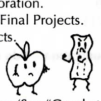
Is it still considered rude to doodle during class if the class is in applied doodling? Such are the philosophical quandries of a graphic design student.

 Click to enlarge.
But you probably won't have to.
Because there's not much detail.
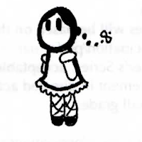
Frilly dress and floaty hair.


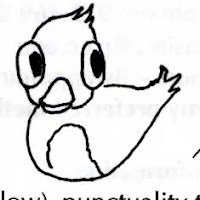
Dog and chicken walked past each other everyday, seperated by circumstance.
Ohmmmmmega 3 fatty acids. (Induced in certain eggs through fish diets.)
"You need goose down? I know a guy."

C'mon, fight me! Or ain't you got the guts?
C'mon, grab your friends.

Glub glub taxes.
Classmate on a class page.

25₵
DELICIOUS THIRST QUENCHING SALT!
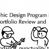
Another successful expedition of the Baseball Cap Explorer Crew
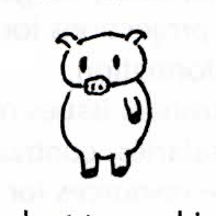
Chubby jitsu.The existential quandries of Hungry Pig.


brand Arson Rods 30 Pack