Monday, December 9, 2013
Bind Those Books!
Ah, finals week. When a young student's fancy turns to caffeine and final projects flutter through the air.
This is one of those projects, if you were wondering! It's a poster about the history of book binding. I made it a large book cover. Because I'm clever like that.
Thursday, November 28, 2013
The nominees are...
I don't think I'm allowed to release the design for this project I've been working on, namely because it includes tentative dates for an event that has yet to happen. But at the same time I'm really excited to share this design. So I've taken all the pertinent information out.
I think this is a good compromise.
Wednesday, November 27, 2013
Book Report
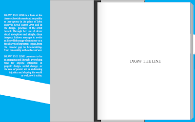
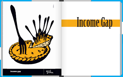
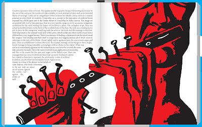
Hey do you remember all those blog posts I made about the book on renowned designer Luba Lukova I've been writing and designing for months now? Well the finished product has been printed in California and is being shipped to me as we speak! I'll have some photos up when it arrives, but until then, here are some previews!
Looks pretty fancy eh?
Looks pretty fancy eh?
Tuesday, November 26, 2013
Lace Chromata
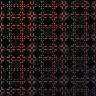
I've done it. I've colored the pattern. And it's pretty spectacular.
To make this image, I used color sequences from Munsell's color space. This system accounts for changes to three main variables: hue (the color), value (the brightness of the color), and saturation (the amount of gray in the color).
I really want you to get the full impact of how beautiful this thing is to me, so let me walk you through the five main components:
This is a circular progression through Munsell color space, beginning at the bottom left and extending up to the top right. Note how all the colors represented are the same value and saturation, but all the hues are changing in the order that they would in a typical color wheel.
This is a diagonal progression through a single hue of Munsell color space, beginning at the top and extending downwards. A diagonal progression keeps the same value and hue throughout, but gradually adds more and more gray to the base hue.
These two progressions actually use a horizontal motion, but with different hues in each. A horizontal progression means that the color keeps the same hue and saturation, but gradually changes value. In the top example, the base hue is red on the right. Each step moving to the left is another step down in value. In the bottom example, the base hue is on the left and moving right with subsequent steps up in value.
Finally, from top left to bottom right, we have the diagonal cross-section sequence. This one gets a little more complex, because we have two variables shifting: hue and value, with the base hue (orange) moving both across the color space to it's compliment (blue-purple) and down in value. The result is a calming transition that avoids creating any of the chromatic gray shades that usually pop up when going from a hue to its compliment.
So knowing all that, join me once more in gawking at how these simple lines drawn through the visual spectrum can be woven together into a magnificently complex tapestry of color.
Tuesday, November 19, 2013
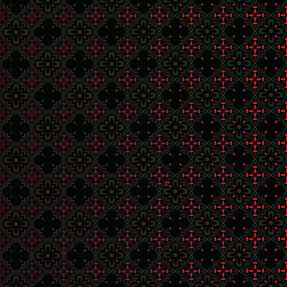
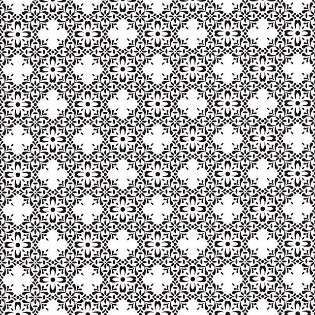
Lace of the Lacking Lacland
This is a progress shot of a project I'm working on for color theory class. I made this. I like this. This is nifty. And when it's done, it'll likely be a lot more colorful. Because color class.
As it stands, though, this would make a nice internal print for an envelope. It's got that floral insanity thing going for it.
Tuesday, November 12, 2013
Monday, November 11, 2013
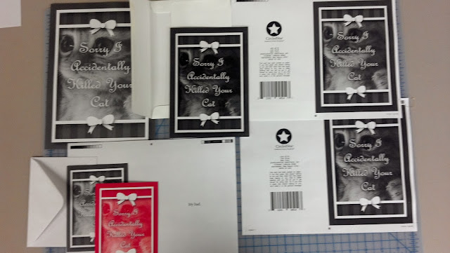
Kitty Cat Murder Inc.
Based off this earlier concept.
This is what my technical processes class looks like most days. Print a thing, color correct, print it again, adjust alignment, print it again, resample the text, print it again, and so on.
Finished product will be up tomorrow! Exciting stuff.
Mr. Lemmon
The air was crisp. The wind rustled the sparse leaves overhead as Johnathan Lemmon dug his chin deeper into the scarf he had wrapped around his neck as he left the house that morning. By now his morning routine had fallen into the background of his consciousness, a blur of repetition that had been slowly and carefully crafted throughout the autumn months only to become entirely unnoticeable. Jelly on toast. Keys in pocket. Jacket on. Scarf around neck. Front door locked. Walk to work.
His routine had never failed him, and with no reason to inspect it closer, Mr. Lemmon let his instincts guide him out into the crisp autumn air each morning, forgetting each step almost as it happened. He had developed a comfortable inattention, and ultimately, it would be this very same inattention that would place his foot in the unusually large crack that had appeared in the sidewalk the previous night, this same inattention that would keep his hands in his jacket pockets until it was too late to break his fall. He had almost begun to notice something amiss when his head met the pavement, after which he lost consciousness and stopped paying attention to much of anything.
Johnathan Lemmon began to pay attention. And what he noticed surprised him. Upon waking from his unexpected collapse, Johnathan Lemmon had become, quite remarkably, a collection of rough lemon sketches.
His morning routine would have to wait.
Tuesday, November 5, 2013
Monday, November 4, 2013
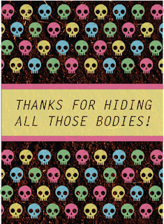
Deepest Sympathies
Sometimes, when I go to class, I don't take very good notes.
Sometimes I forget to take down the due date of a project.
Sometimes I panic and assume that the project is due the next day.
Sometimes I stay up all night trying to complete the project.
Sometimes, when I stay up all night to complete a project, I make decisions that I would never make whilst fully-rested and lucid.
Sometimes, this happens:
It's a greeting card, and it's not due until next week.
So I have time to redo it.
If I want to redo it.
...
I think I might just keep it.
Friday, November 1, 2013
ROWA Theatre
What do I doodle in typography class, you ask?
Ridiculously Ornate Web Acronyms.
This concludes today's presentation of ROWA Theatre. Thank you for joining us, and have a pleasant evening.
Ridiculously Ornate Web Acronyms.
This concludes today's presentation of ROWA Theatre. Thank you for joining us, and have a pleasant evening.
Wednesday, October 30, 2013
The All Hallows Project, Day 11
And finally, on this, Halloween Eve. All Hallow's Eve Eve. I present to you the 31st image! This here's a Demon (English).
And that concludes the All Hallows Project! To date this is still one of the largest projects I've every undertaken, and I think a lot of really cool posters have come of it.
And hey! All posters can be purchased in a wide variety of sizes at this here link! So there's that!
Tuesday, October 29, 2013
The All Hallows Project, Day 10
Deep in the Forgotten Woods, a demonic Click to Enlarge lies in wait...
Dragon (Slovak), Bat (Polish), Scarecrow (Gaelic).
Monday, October 28, 2013
The All Hallows Project! Day 9
I Click to Enlarge you in your sleep...
Shade (Hebrew), Incubus/Succubus (Belerusian), Minotaur (Macedonain).
Sunday, October 27, 2013
The All Hallows Project! Day 8
Click to Enlarge or Suffer the Consequences...
Giant (Icelandic), Witch (Korean), The Fly (Bulgarian).
Aw yeah! Day 8, baby! And it's just gonna keep going right up until Halloween! We're getting more week out of this week-long series than the nature of the universe allows!
Saturday, October 26, 2013
The All Hallows Project! Day 7
The Click to Enlarge is coming from inside the house!
Cyclops (Estonian), Siren (Croatian), Bigfoot (Tibetan).
Friday, October 25, 2013
Thursday, October 24, 2013
The All Hallows Project! Day 5
Stay Low, Keep Quiet, Click to Enlarge
Dr. Jekyll/Mr. Hyde (English?), Cthulhu (Creole), Bogeyman (Traditional Chinese).
If you're wondering why there's a question mark after the word English up there, now might be a good time to discover the mouse-over text.
If you're wondering why there's a question mark after the word English up there, now might be a good time to discover the mouse-over text.
Wednesday, October 23, 2013
The All Hallows Project! Day 4
As she bent down to pick up the meat hook, the last words she uttered, in a panicked whisper, were "Click to Enlarge!"
Day 4! Today we have the Creature from the Black Lagoon (Portuguese), Vampire (Romanian), and Mummy (Arabic).
Tuesday, October 22, 2013
The All Hallows Project! Day 3
Click to Enlarge, Igor!
And here we have the Headless Horseman (German), Zombies (Japanese), and The Invisible Man (Norwegian).
Low-res pixel art sorta loses its impact when the image itself is tiny, doesn't it?
Subscribe to:
Posts (Atom)


