Tuesday, April 30, 2013

Burst Calendar: July

It's like grass and stuff!

Since I've already done one continuous outline and it's reversal, this one uses a different format. This one's made up of a bunch of long quadrilaterals, so every shape points to two dates. Needless to say I cheated some, on account of the odd number of days in July. See if you can find the odd one out!

Work holidays in contrasting colors to the title, which for July include Sundays and apparently there's some sort of holiday on the 4th of July, but I can't for the life of me remember what it's called.
I Don't Believe You! July!

Monday, April 29, 2013

Burst Calendar: June

Same thing as yesterday, but now it's June 2013 and the type in the center is reversed. Work holidays in complimentary colors, which in June are just Sundays.

I've got two more of these as part of a final project for school. I'm probably going to post them one at a time over the next two days.

So you can expect August by May.

Don't June Oh?

Sunday, April 28, 2013

Burst Calendar: May

Any of y'all need a weird calendar? 'Cause I made a weird calendar. May 2013 in one continuous, self-intersecting outline of jagged edges and questionable legibility. Dates in the contrasting shade are work holidays, which for May this year are just Sundays and Memorial Day on the 27th.

I'd like to say it was harder than it looks to get this shape to have exactly 31 points and spell out the word "May," but frankly I have no idea how hard this looks.

Yes You May

Thursday, April 25, 2013

Capture the Sword 3: Merger Mayhem

It's here! The third installment of the Capture the Sword series has arrived! I took a radically different direction with the level design for this one, in that I made it the least radical thing imaginable: an office building.

Minecraft is sort of geared towards a medieval build style. Cobblestone, stone bricks, swords, bows, armor, magic, potions. Building a modern office building was a bit of a challenge, but it was really fun to do, and it turned out pretty well. We've got everything from cars to copiers to desks to potted plants. Here are some pictures, and here's the download link (Mediafire).


Wednesday, April 24, 2013

Janice Did Not Die in Vain

It's official! Last night at the film festival, Paradium and You won 1st Place in the Animation category and the overall People's Choice prize!

I wasn't able to make it to the screening until about an hour in, so I missed the third- and second-place winners in animation. I went in not knowing if I had received a previous prize or if I had even been considered for the category. Seeing my name and the title of my animation up on the screen was an absolute shock, and I'm still sort of riding that phenomenal buzz today.

This is really exciting. I was honestly not expecting to win - not for lack of trying, but for lack of time. As I've previously mentioned, I found out about the festival three days before the deadline and I was using probably the worst possible program for the job.

However it happened, I won, and I'm pretty darn stoked about that.

Just so this whole thing isn't text (or at least type), here're the production notes. I think it's kind of cool to see what certain bits look like in relation to the finished product, so if you're into that too, here's my brainstorm process. If you're not really into that, there are some doodles of Janice in there too. Your boat floats in a manner known only to you.

And yes, I am aware that my handwriting is a masterpiece of typography. Please stop flooding the comments with your praise.

Organization!

Saturday, April 20, 2013

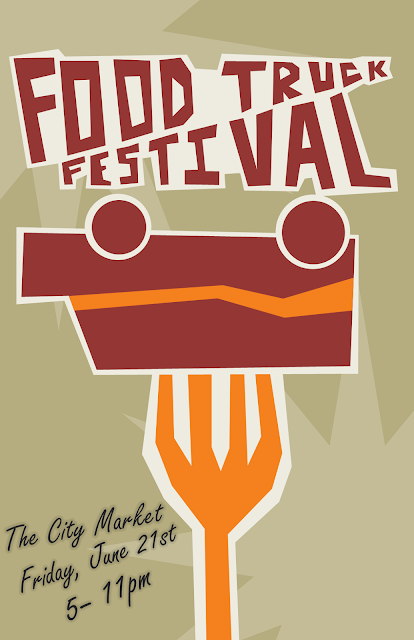
Food Truck on a Fork

SOLID COLORS! POINTY SHAPES! YEAH YOUTH CULTURE!

This is my version of the food truck festival that was selected by the group I'm designing for. I kind of like it. The color scheme and visual style is alright.

But honestly, it was my least favorite of the proofs I sent it. It was sort of just thrown together at the last minute because three concepts were requested and I poured all my effort into the previous two (see here and here).

I'm not exactly going to become embittered towards creation-by-committee because of this, it's just not the direction I'd have taken it, is all. Oh well.

Friday, April 19, 2013

Pathfinder in PowerPoint

Okay. I've got sort of a love/hate relationship with Microsoft right now. I've not exactly kept it a secret that I use PowerPoint for vector drawings probably a lot more than I should.

But one of the major drawbacks to using PowerPoint over actual drawing programs like Illustrator is that PowerPoint isn't a drawing program, it's presentation software. There are some things you'd expect from a proper drawing program that PowerPoint just can't do, like pathfinder selections.

Except that PowerPoint 2010 totally has pathfinder selections. Microsoft just hid them.

I can't explain why. Honestly the whole thing is a little baffling to me. Both Illustrator and PowerPoint are vector drawing programs, and both deal with object outlines. It would make sense that they would both have pathfinder abilities, and it seemed odd to me that PowerPoint didn't. After a bit of digging, it turns out it does, but you wouldn't know unless you looked very, very closely.

For those unfamiliar, pathfinders are tools used to modify object outlines in a way that corresponds with other object outlines. With pathfinders, it's possible to combine multiple shapes into one based on their outline, like so:

E pluribus unum, I guess.


In Adobe Illustrator, enabling pathfinders is as simple as going to Windows > Pathfinder. Here's the window. Very simple, very prominent.

Very DEADLY!?!?!? No.

Now let's devote a few paragraphs and a long string of visual aides to show you how to get to pathfinders in PowerPoint.

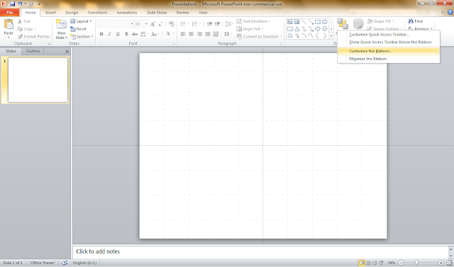
First, open PowerPoint. Right-click on an empty portion of the toolbar. Select Customize the Ribbon. That's right. Not only is this feature hidden, but the feature to unlock the feature is hidden.

Is there like a cheat code to get to this menu?

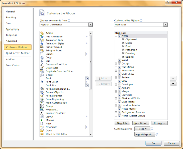
Clicking Customize the Ribbon will open the PowerPoint Options dialogue box. Here you can change the contents of your existing toolbars, or, in this case, create a new one.

So intuitive!

This next bit is my personal preference. You can create your toolbar anywhere you'd like, but I prefer to put it under the drawing tools menu, so it shows up when shapes are selected. In order to do that, you'll need to open the right drop-down menu and select All Tabs.

The surface has yet to be scratched.

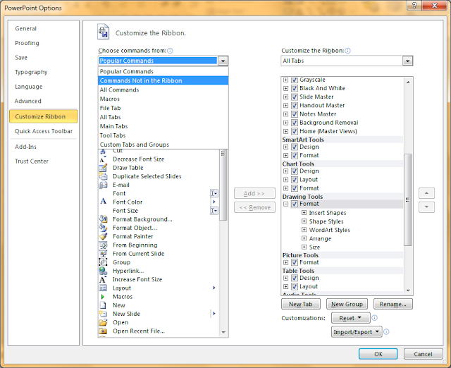
Navigate down to the Drawing Tools and select Format. Clicking the New Group button (highlighted in blue at the bottom) will add a new group, which can hold commands like those seen in the left list. So now we can put the pathfinder commands in that group, right? Surely there isn't another level of needless obscurity on top of all this to prevent you from unlocking this basic drawing feature, right? Surely not.

Assure Shirley, Shore-Lee.

To get through the next level of needless obscurity, change the Popular Commands dropdown to Commands Not in the Ribbon. There is a section specifically devoted to the things being kept hidden. There are a lot of baffling things to look past with this whole process, but take an extra moment to let this particular bit of nonsense sink in.

It's like a Russian nesting doll of anger and frustration.

This menu is mostly filled with options that exist elsewhere in the program, but not necessarily on toolbars. Menus that show up when particular objects are right-clicked, dropdown options, subpanels, and the like. There is a set of commands, however, that doesn't appear anywhere else in the program. These are the Shape Combine, Shape Intersect, Shape Subtract, and Shape Union commands. These four options compose the basic abilities of any pathfinder set. Highlight them one by one and - with the new group selected - click the Add button between the two menus.

Bringing it all home.

And there we have it. Now you've got your own pathfinder panel. Let's name it and get out of here. Click Rename down below the right-hand menu next to the New Group button.

I'm sorry Right Brace. Today is not your day to be saved.

This is the rename menu. Because everything else made so much sense. You'd think with the giant array of icons, icon selection would be an important part of this process. As far as I can tell the icon you select doesn't show up anywhere. The important thing here is the Display Name box. Again a matter of preference, I call it Pathfinder, you can call it Applefritter, I'd just recommend that you not leave it as "New Group," because this customization actually shows up on your screen when you access the group.

Pushpin, Funnel, Hollow Sadface, "Dollar Sign", and [Binary] are all suitable options here.

Exit the PowerPoint Options menu, and test out your new PowerPoint pathfinders. The options will stay grayed out until you select at least two shapes.

It's magnificent.

These options work pretty much the same as in Illustrator. I've already made a poster in PowerPoint utilizing this feature. PowerPoint's pathfinders are functional. They're useful. And yet they're still very much hidden. When I went to see if there were any other tutorials on this topic, I couldn't find any other reference to these features other than a German YouTube video from 2011 with 300 views. (credit to dipanteratuts).

If anyone knows why this feature was hidden, leave a comment. I'd love to hear some explanation. Like I said, I'm pretty love/hate with Microsoft over this whole thing right now. On the one hand, it's really exciting to learn that my most familiar drawing tool is even more powerful than I thought. On the other hand, this feature has been here for at least three years and Microsoft seems to have gone well out of their way to make sure it was only accessible in the least intuitive way possible.

It's weird, is all. The whole thing is weird. Happy pathfinding.

Wednesday, April 17, 2013

Shish Kabus

Look kids! Break open your piggy banks, because the ONION TROLLEY is drivng through the neighborhood!

Another poster for the upcoming food truck festival. I made another one because the first one seemed too formal for what's essentially a street fair without the carnival rides.

Tuesday, April 16, 2013

Food Truck or Roast Duck?

Either way it's making me hungry.

A lot of things have been happening recently, but not a lot of them design related. Here's one of the newer ones that is.

I've recently started volunteering for a young professionals organization in exchange for free membership. I'm basically working for exposure at this point, but the exposure is through a group dedicated to networking, so I like my odds.

I don't know if you can tell by the poster, but I'm still waiting on some details about the event.

Friday, April 5, 2013

Abstract Tracts

Hop a car to the sketchy part of town!

Another assignment for 2D Design. This is actually the same project as the fish from earlier, abstraction. I have conflicting opinions about this one, in that my opinion that it's awesome conflicts with several of my classmate's opinions that it's weird.

It looks like an old pen sketch of an old locomotive how is that not the best?

Thursday, April 4, 2013

Draw Duel

Two people, two paper pads, two pencils, and an impartial panel of judges. This is all you need to have yourself a proper draw duel.

The rules are simple. A random subject is selected by the judges or generated by an art prompt randomizer like this one from Magatsu. As soon as the subject is announced, the competitors have ten minutes to create the given topic using nothing but pencil and paper before them. Ideally, they are not allowed to see their opponent's progress. The countdown is kept where both contestants can see it, and at ten minutes, it's pencils down, and the judges must select which drawing best captures the subject.

Draw duels are awesome. They're a great way to settle arguments and breed hostility between your friends while honing your artistic skill. Here are a few of the duels I've been involved in. All my drawings are on the left, my opponent's are on the right.

If you click the little pictures they stop being little pictures but it's okay because then they're big pictures.
 
Subject: A Gas Station in the Middle of Nowhere

Subject: Determination

Subject: A Dusty Museum

Subject: Something Sweet

Subject: A Place Time Forgot

Subject: Chest

Tuesday, April 2, 2013

Capture the Sword 2: Cavern Clash

Remember Capture the Sword? It's a Minecraft PVP game that I created a while back. Think capture the flag, but with swords. I made a new map for it, and it can be downloaded below. And below that there's some nice pictures of what it looks like.

I am good at descriptions of things and stuff.

Download (Mediafire)


Monday, April 1, 2013

Animation with PowerPoint

PowerPoint can be used for animation. It probably shouldn't, though.

Paradium and You - The Citizen Guide to Safety came out yesterday. It was initially done as an animation entry to my local film festival and slowly, through hard work and determination, became the same thing but completed a bit too far past the deadline.

I didn't really have any place to enter a film festival. I'm an ex-culinary student who switched majors to pursue graphic design two months ago, and neither of the fragmented educations I have received thus far have prepared me for the world of competitive short film making. But I saw a poster for the festival on the day of the deadline, determined that if I could throw anything at all together in the four hours I was allotted it'd be a miracle, and decided that amateur speed cinematography sounded like a fun way to spend an afternoon. And of course, in the absence of proper animation software or common sense, I figured the fastest thing to do would be to make an animation in PowerPoint.

If I've learned one thing, it's this: PowerPoint is not appropriate software for animating.

I've previously pointed out that PowerPoint can export to video. This is a wonderful feature if you're looking to put a slideshow on YouTube. It is a terrible feature if you're trying to animate, because it lulls you into believing that if you can make a good bulleted list, you can make that list dance.

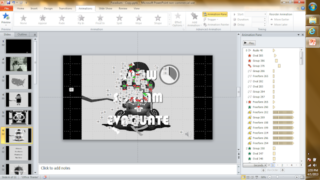
Take Janice, the only animated character in the five minute animation that can honestly be said to be animated, and that's if we're being fast and loose with our definition of honesty. Janice is on screen for a minute and forty seconds. During this time, she waves, blinks, has an x-ray look at her bones, shakes in nervous anticipation for twenty seconds, and collapses over dead. She doesn't walk around, doesn't turn her head away from the camera. This is her animation sequence in PowerPoint.

"Kiiiill meeeee..." "I'm trying!"


Can you understand what's going on in there? I made the thing and I can't understand what's going on in there.

The problem with animation in PowerPoint is that it doesn't support frames. Every shape from every second is in your work area at once, stacked in the order in which it will appear on screen. You can't even move things out of your way, because doing so effects how that shape will appear in the final product.

And the range of animations you can apply to any given shape is decently varied, but you have to bend it and wrestle with it to get anything to do what you want. See in the above image, those black bars in the animation pane on the right? That's a spin effect. In order to get Janice to shake in horror, I had her dress spin 0.5 degrees clockwise in a span of 0.1 seconds over and over and over again. It was possible to do, and the effect turned out looking alright, but I can't help but feel like there had to be a better way to do that.

I don't animate often, and I don't animate particularly well, so I don't know how common vector shape animation is, but that's all you can do in PowerPoint. That's why I keep talking about putting effects on shapes. If you want something to move, you've got to make that something a smart object and give it a set of choreography instructions from a predefined list. There's plenty of customization within that list (a shocking amount, actually. Like I mentioned, you can make fear quivers from spins). But it ultimately feels like it's more geared for text effects. Like some sort of presentation software or something.

I'm expecting too much from PowerPoint. Just because it can be used as a vector drawing program doesn't mean it should be. And just because it can be used to make fancy WWII era dark-comedy animations doesn't mean it's the best tool for the job. It fact, it's probably one of the worst. It's like an artist who dedicates his life to creating portraits in bottle caps. They may be wonderful portraits, but ultimately it's an unnecessary and somewhat silly limit to put on an artist.

So yeah. I guess if every you felt the compulsion to make animations in PowerPoint, the lesson here is don't. Use different software. It's probably easier and the results will probably be better. I'm not really sure what other audience I could possibly be writing this for.