Image 1: Fuzzy
Image 2: Eliminate
Image 3: Floorplan
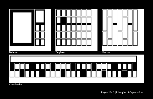
We had another four-panel assignment recently, this one on the principles of organization, or the way a design is divided between subjects and whitespace. As it was taught in this class, though, there are only three principles, so the fourth panel went to a combination of all the other principles.
Balance: Balance is probably the most common way of organizing an image. It refers to the amounts of each element in relation to each other. Image1-Panel1 creates a balance between internal and external with a dividing line of elements. Image2-Panel1 introduces an unusual balance, dividing the image between a defined but less prominent series of crosses opposed to an open, empty field of whitespace. Symmetry is a form of balance, but asymmetrical balance can be achieved a number of ways, such as using one large object used to balance several smaller ones, as seen in Image3-Panel1.
Rhythm: Rhythm is the defining aspect of a pattern. Anything that repeats in a noticeable way can be said to have rhythm. This is seen in the grid in Image1-Panel3, or the diminishing size and distance between the X shapes in Image2-Panel3. Image3-Panel3 takes a different approach, employing a pattern not of shapes but of a predictable pattern of breaks in each shape.
Combination: I like the combination panels. They're neat.
I'm posting the three I have right now because I really, really don't want to be tempted to do another gestalt week thing. I may miss posting a few days here and there, but it just got so hard to say new things about the same ideas repeated over and over in designs made only to showcase those ideas. So there'll be no organization week. Sort through your clutter on your own time.


No comments:
Post a Comment