Monday, August 25, 2014
Text Tattoo Week! Day 3: Ampersand
When designing the most generic typographic tattoo, it helps to use some of the most generic tattoo motifs. Hence this half-filled ampersand.
Sunday, August 24, 2014
Type Tattoo Week! Day 2: Still
I chose this word for the second tattoo mainly because of the anatomy of the type. The lower finials of each of these letters forms a neat little hook motif that I think works well with the idea of stillness - keeping things in place and all.
Saturday, August 23, 2014
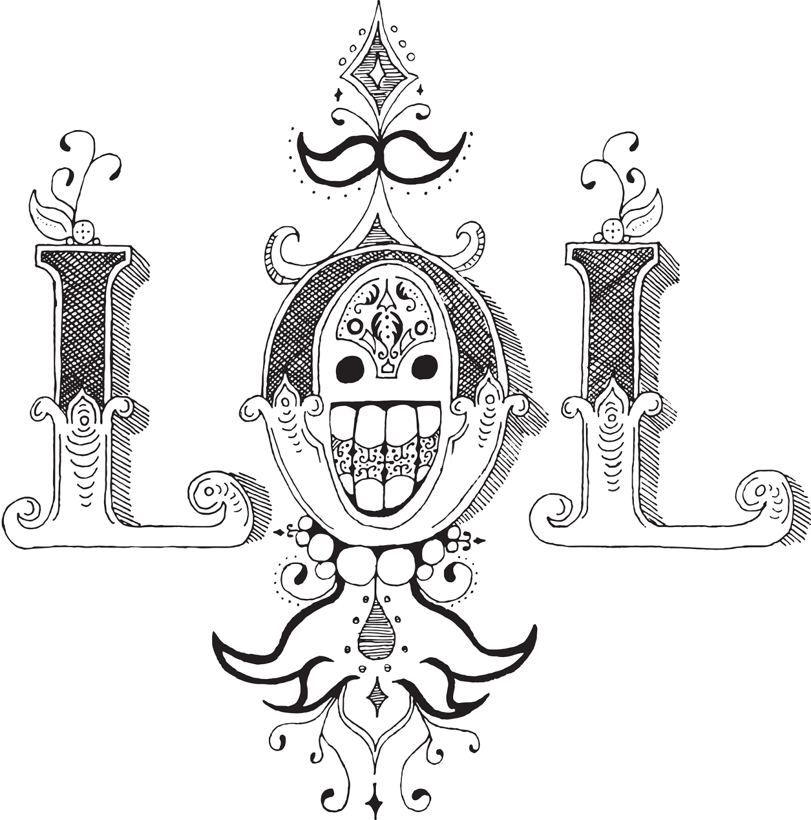
Type Tattoo Week! Day 1: LOL
I'm back in school! And the first assignment for my new Advanced Typography class has been to design typographical tattoos. So I'm going to post a week's worth of those to get us back in the swing of things.
This might look familiar. It's sort of an extension/reimagining of the ROWA concept from an earlier typography project. I chose the LOL mark because I've always been fond of it's semi-symmetry and the cute little happy face incorporated into the center. However, in the process of drawing it larger I've somehow made it much, much creepier. So that's a life choice I have to live with now.
Thursday, May 8, 2014
The Roaring Five-Years-From-Now
This was past of an art history project, the assignment was to create an educational product that could be sold in a museum gift shop to teach people about a particular movement. Hence this art deco desk calendar. It's chock full of all kinds of lovely prints and fantastic information about the era, the art, and the legacy of art deco.
Poster in this image is © Art.com and Steve Forney. Used non-commercially in an academic setting.
Thursday, May 1, 2014
Tuesday, April 8, 2014
Like Grains of Sand
Five shades of gray and some little color accents that I may or may not keep. I've always had a fascination for clock towers, and I'm happy to report that nothing has changed.
Sunday, April 6, 2014
World Domination Made Easy
The Uchukira Corporation is proud to announce that How to Assemble Your New Doomsday Device has won first prize in the animation category at the Take 5 Film Festival!
Here are some production notes if you're into that kind of thing.
Here are some production notes if you're into that kind of thing.
Friday, April 4, 2014
I'll Make You a Pizza You Can't Refuse
There's a pizza place nearby with a mafia theme. Their current menu doesn't really suit their restaurant - it's built around buffet and delivery orders, but finding a way to order the pizza you want is a bit of a mess. It lists all kinds of things you don't need to know while in the store and things that don't do you any good outside the store, like the contents of the salad bar and the drinks available at the drink fountain. Here's the original for comparison.
I redesigned and streamlined their menu, turning it into a tear-away notepad. The focus was on user experience, and I wanted a design that would be easy for the customers and cooks to interact with. This menu explains everything you need to know about building a pizza with little pieces of mafia theming sprinkled throughout. I also redesigned the logo while I was at it.
I redesigned and streamlined their menu, turning it into a tear-away notepad. The focus was on user experience, and I wanted a design that would be easy for the customers and cooks to interact with. This menu explains everything you need to know about building a pizza with little pieces of mafia theming sprinkled throughout. I also redesigned the logo while I was at it.
Sunday, March 23, 2014
How to Assemble Your New Doomsday Device
Congratulations on your new Uchukira™ Doomsday Device! Here's a handy video on how to easily and quickly assemble the most reliable planet killer on the market today. Brought to you by the Uchukira Corporation.
Uchukira: World Domination Made Easy™
This is a project that I've been working on for the last few days. The student film festival from last year is coming up again, and I managed to find out about it a whole week in advance this time!
I decided to do the animation in PowerPoint again, because I'm still pretty familiar with the software and I don't animate enough to buy any actual animation software. Here's a slide from the original PowerPoint and another excellent case study of why PowerPoint is not made for animation.
The film festival is on April 4th, so I'll let you know how it turns out. Wish me luck!
Saturday, March 8, 2014
Curves and Lines
You know those times when you want to convey a certain feeling in text and none of the fonts you look at convey that feeling so you make the font yourself?
I'm right in the middle of that.
As you may have guessed, this is for a business card. For the time being I'm just building the words I need ad hoc, but someday when I have some more free time I might expand this out into a complete font. It's got a cool, clean geometric feel that I really like.
Subscribe to:
Posts (Atom)


